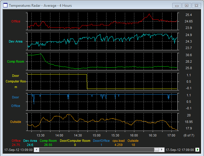
Similar in concept to Strip Charts, Stacked Line Charts differ in that each pen is given it's own plot region within the Plot window. Stacked Line charts should be used when maximum clarity is required as by implication none of the trend lines will overlap.
.
When in Stacked Mode, each pen has its own individual Y-axes allowing the item name to be displayed on the Left hand Y-axis and the Scales on the Right-hand Y-axis.
Tip: Use the Y-Axis Label Mode User Preference to control how the Y-Axis Labels are formatted and the value that is displayed for the mid axis tick mark.
If there are too many pens for each to be displayed in its own plot region, a reduced set of pens will be shown. The number of visible pens versus the total number of mapped pens in shown as a count at the foot of the Right-hand Y-axes column.
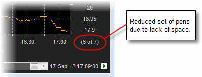
The format is as follows:
(X of Y) - where X is the number of visible Plot regions (Pens) and Y is the total number of mapped Pens.
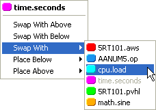
Note: To change which pens are visible, or to re-order the Plot regions, the user should right-click over one of the Y-axes.
The resulting menu allows the following options:
Swap with Above
Swap with Below
Swap with ... Item A
Place Below ... Item A
Place Above... Item A.
where Item A is one of the other mapped pens (see below)