Use this section of the tab to control how data is represented for X-Y Graphs.
Note: The default values for the fields can be changed via the Cursors section of the User Preferences Plot Tab.
|
Control: |
Default: |
Purpose: |
|
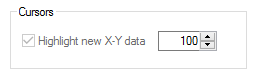
Highlight new X-Y Data (Check box) |
(Set via User Preferences) |
Tick this check box if the latest data values should be highlighted on X-Y Graphs (both line and Scatter). New data points are colored using the color assigned to the Y-pen, 'older' points use the X-pen colour.
Note: The most recent point (singular) will also be circled in the Y-pen color. Tip: With earlier versions of Sapphire (pre 5.4) the circle used to highlight the latest data item used the X-pen colour. To replicate this behaviour in release 5.4 onwards set the Y-pen colour to be the same as the X. |
|
Highlight new X-Y Data (Value box) |
(Set via User Preferences) |
This field controls the time period for which new data should be highlighted on X-Y Graphs. The period is equal to the number set multiplied by the plots refresh rate. So for a plot with a 5 second refresh rate, setting a value of 12 will mean that the most recent 1 minutes data is highlighted. For a plot with 1 minute refresh rate, setting a value of 60 will mean the last hours data is highlighted and so on.
Note: Since the setting defines a time period and not the number of points to highlight, the 'amount' of pairs highlighted as new data will decrease once plot compression comes into effect when zooming out. Tip: A plots refresh rate can be viewed on the Plot Properties Details tab in the Refresh Rate field when the Compression rate is 1:1 or lower (i.e. 1:n). |